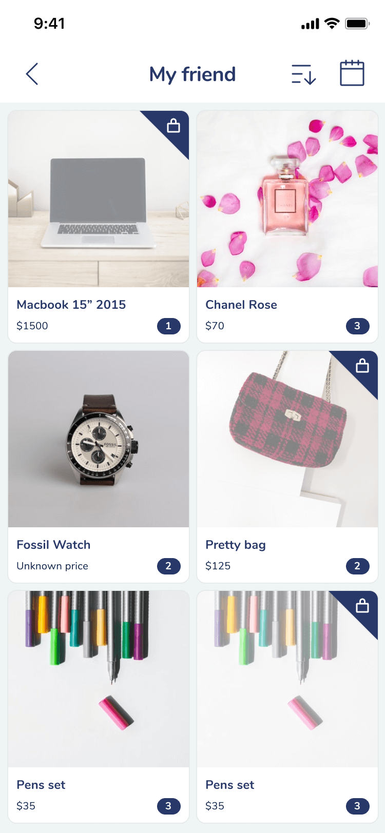
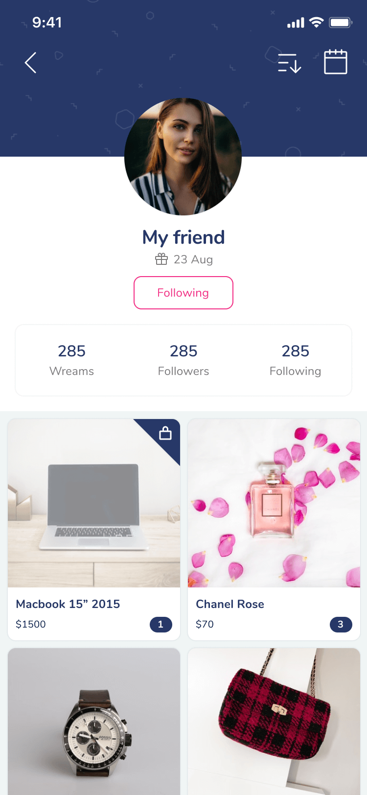
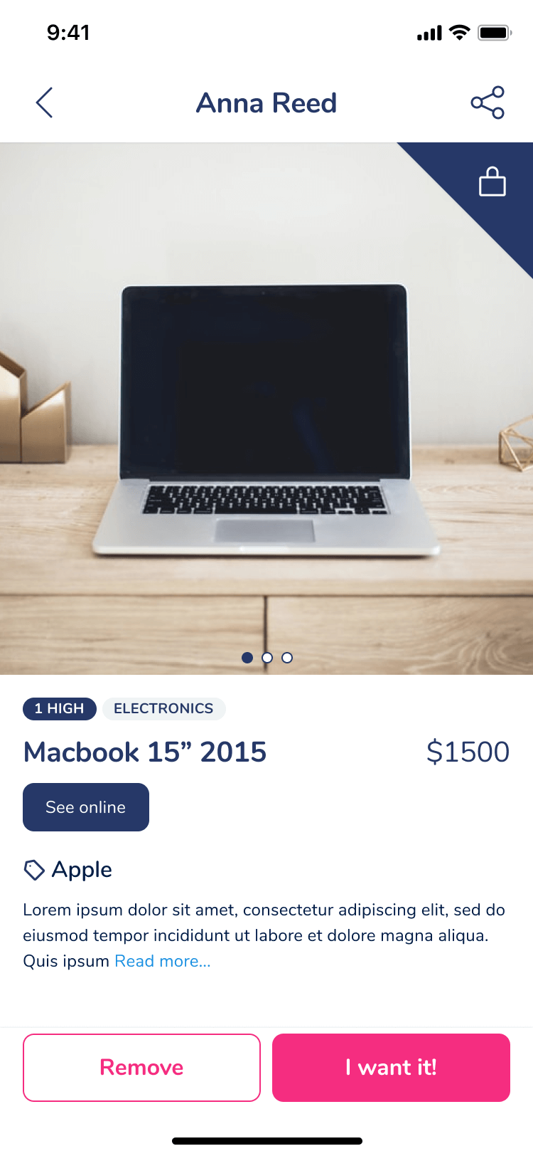
Wream allows its users to have a unique wishlist, accessible from anywhere and at any time. Any product or service that a consumer wants to acquire or receive as a gift will be registered in their profile, as well as their special dates, to be able to be consulted by the user and by the people he/she wishes.
Marta, Wream's CEO, had a mobile application with an outdated-looking interface and had to include new features to start monetizing her product.
Marta had a remote development team, which designed the new interface with a more modern look. However, she wasn't 100% convinced and decided to contact me. When I received the file, I realized that sizes were inconsistent throughout the design, with fonts and margins that needed to be unified.
In addition, being an app based on wishlists, the main problem that Wream had as a product was engagement. The user signed up, filled in their special days, added a few products to their profile and then there wasn't anything that made them come back.
Wream planned on finding advertisers/sponsors to make the product profitable, which inevitably led to increasing the time the user spent in the app.
At that moment, users were focusing mainly on creating their wishlists by themselves. The social component of the platform resided in the users sharing their profiles. They would have to show attractive metrics to the sponsors to receive better deals from them.
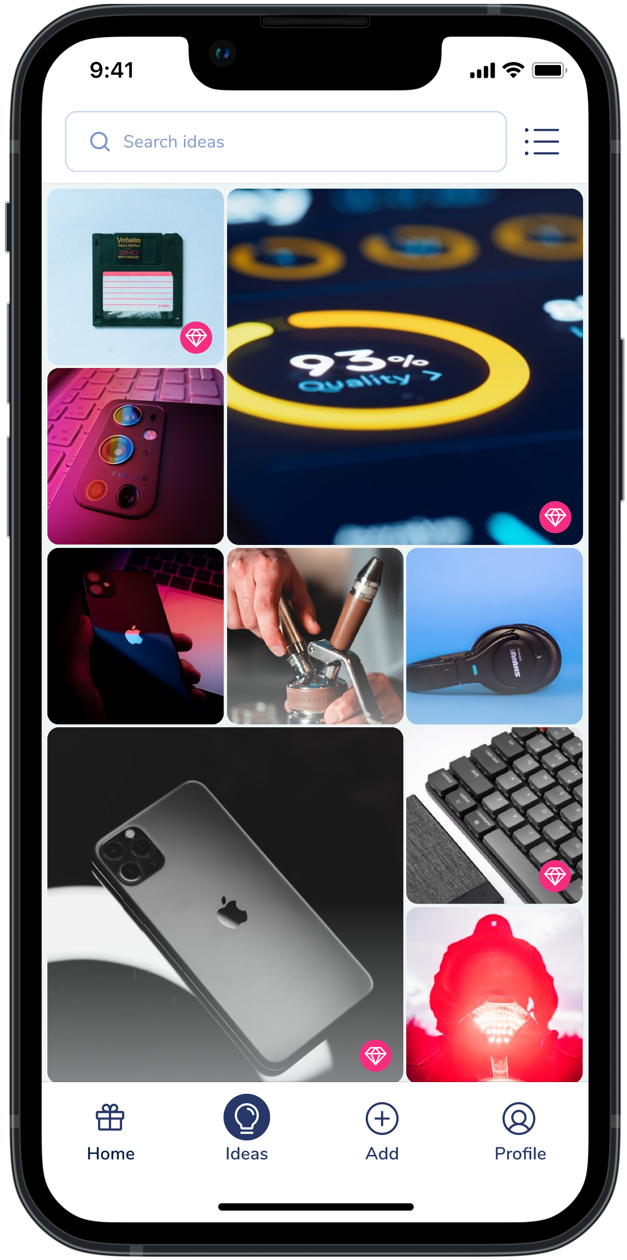
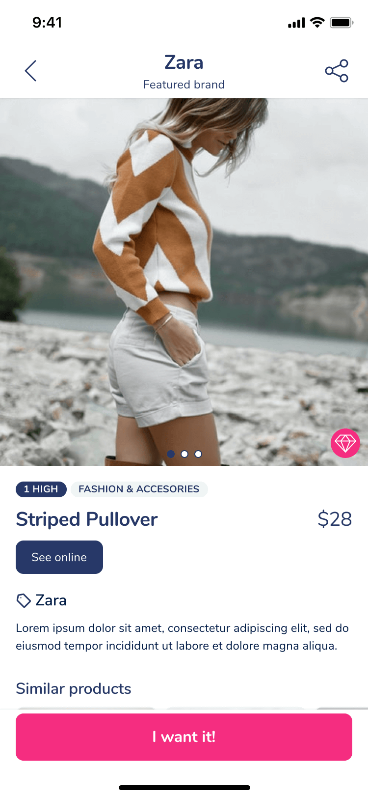
We came up with the idea of a discovery/inspiration section. A pool of different products based on the user preferences, where the user would also get new ideas. That would also serve to place the sponsored products in between and give them more visibility.
When you talk about a place to look for diverse ideas, you have to talk about Pinterest. We tried to get inspired by this tool and make it easy for the user to discover new products they would love and add them to their wishlist seamlessly.
I also suggested facilitating the addition of products to the user's list, just like Pinterest. The user should be able to share the page from an e-commerce to Wream and have the name, images, and price of the product easily. This was discarded due to the cost of implementation at that moment.
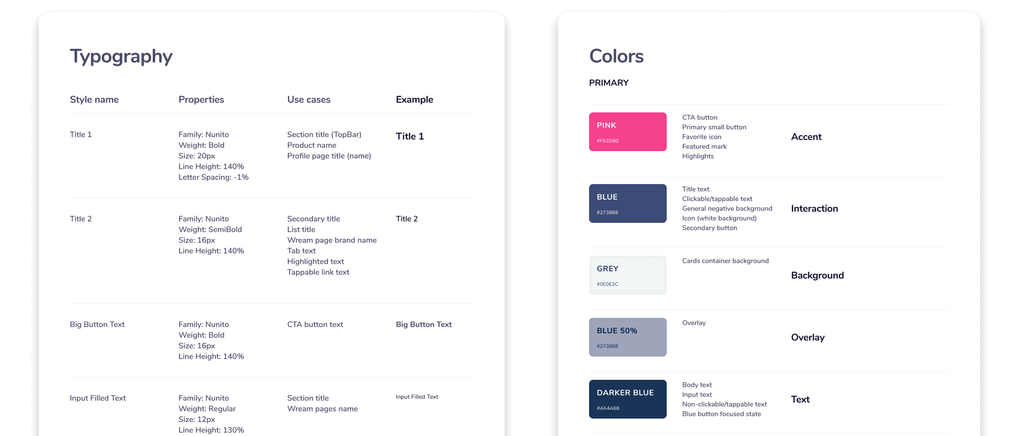
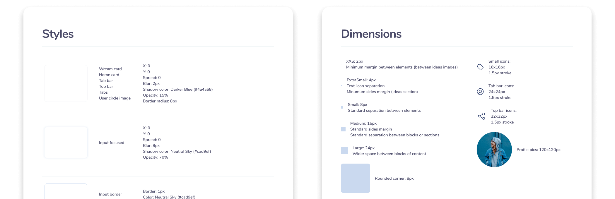
Once the new features were clear, I reviewed the visual components that we had to make. I defined different hierarchies in the elements of the components and standardized them.
The construction of the design system for the app consisted in a file that collected text styles, colors, icons, and other visual elements that integrated the platform. The dimensions of the different elements and components and the use cases of all the elements were detailed in these guidelines.
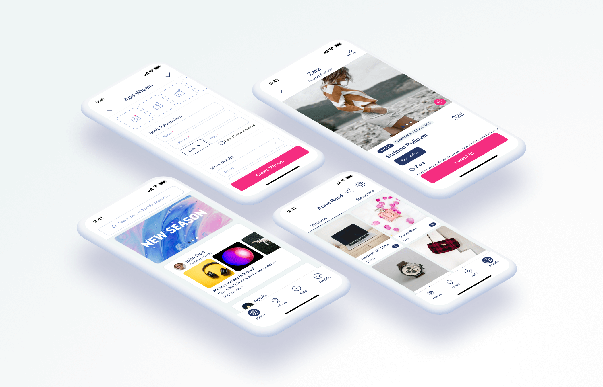
Through this design system, the development team had a knowledge source for every component and every use case. We also created the main screens and a basic prototype to show the flow to the team developers.
The tool used for the project was Figma, due to the ease of collaboration and hand-off for the development team.