Solofoodies centralizes and all of the collaborations for both sides, making them easier to track, assisting the foodies election and facilitating communication and reservation tracking. This solves two problems: It helps restaurants to improve their online presence through recommendations towards bloggers and influencers (from now on, foodies) who seek new places and experiences; and it simultaneously helps customers to be recognized professionally thanks to the reviews and metrics system through collaborations.
Ruben and Isaac had a well-defined user flow with the features that their users required. However, they needed a hand with the UI of their MVP. They wanted a clean, functional and intuitive interface.
When Solofoodies contacted me for the first time, they had a concept developed and some prototypes. A relative was helping with the design but they wanted to rely on another professional that was fully dedicated. They needed a visual solution on a budget to launch as soon as possible.
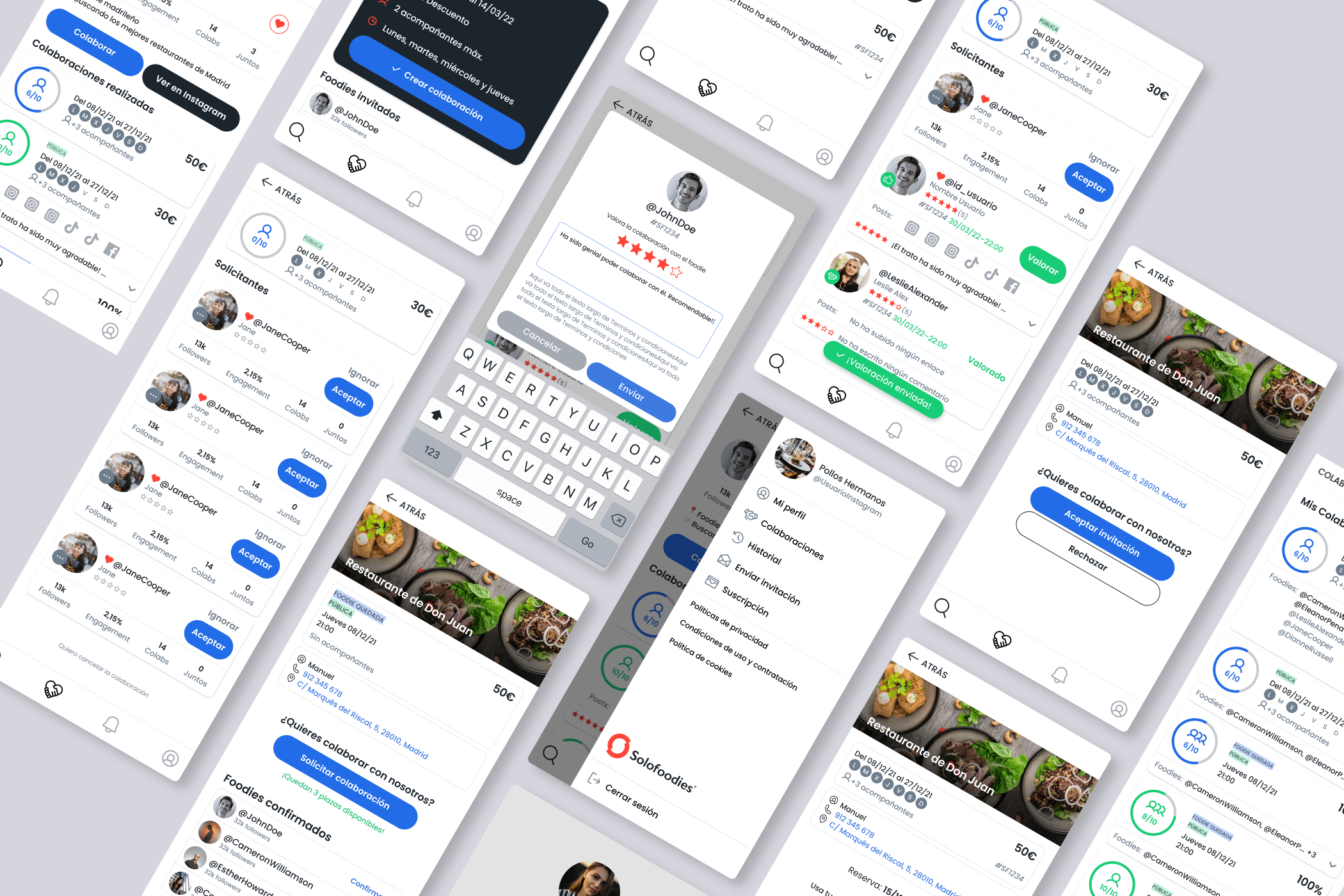
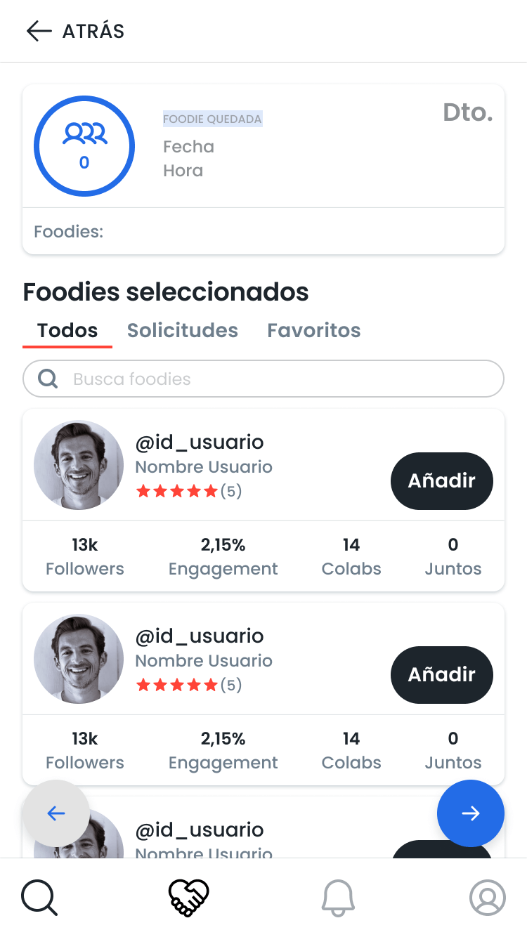
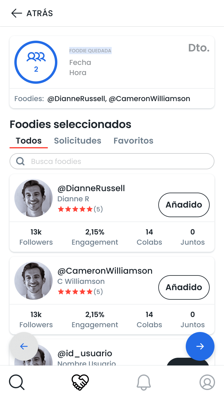
I made various proposals and we created a component to display all the information that a user could need, leaving the additional information for the details page.


Components had to be identifiable with a minimum amount of color and space. So we mainly used size and contrast to build a visual hierarchy.
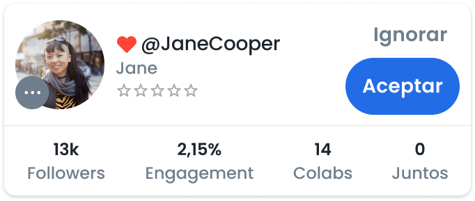
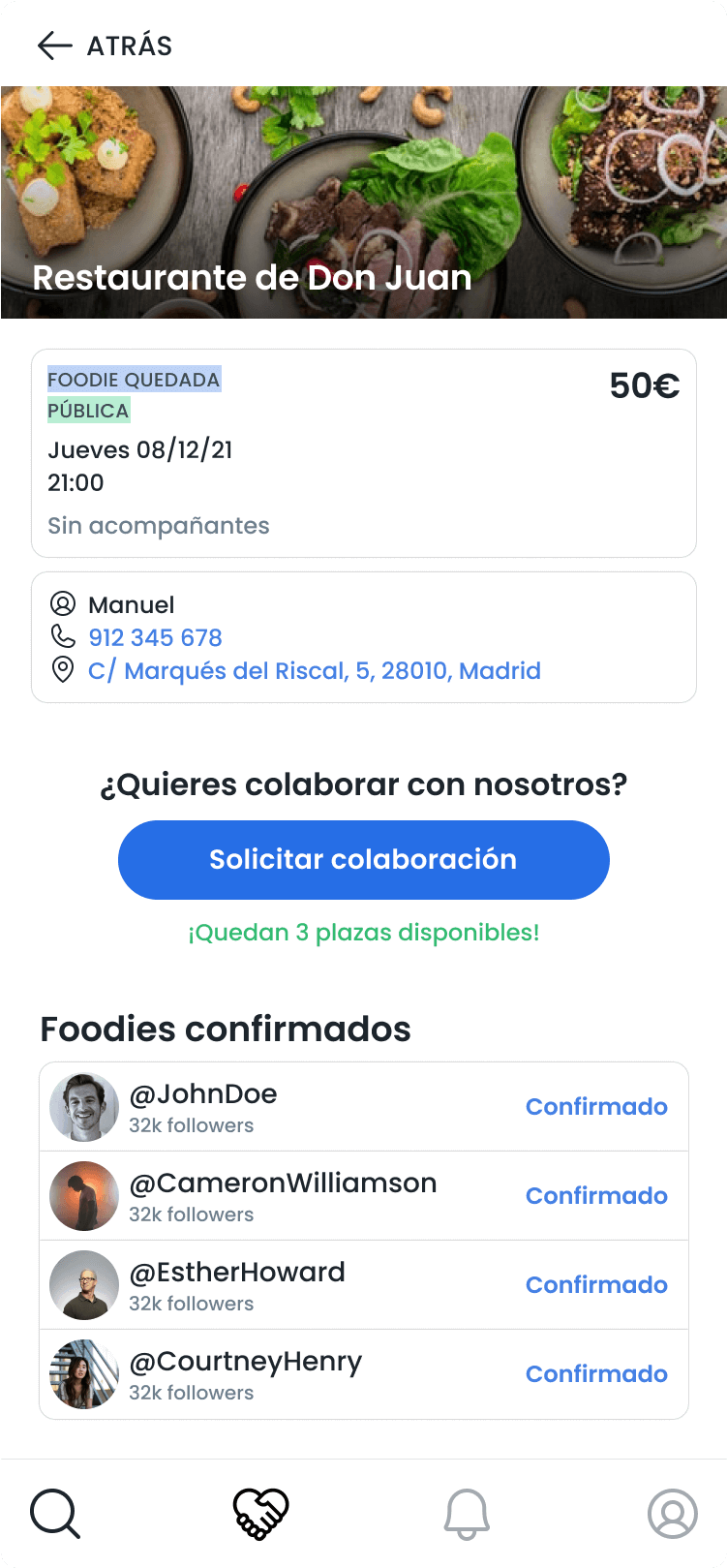
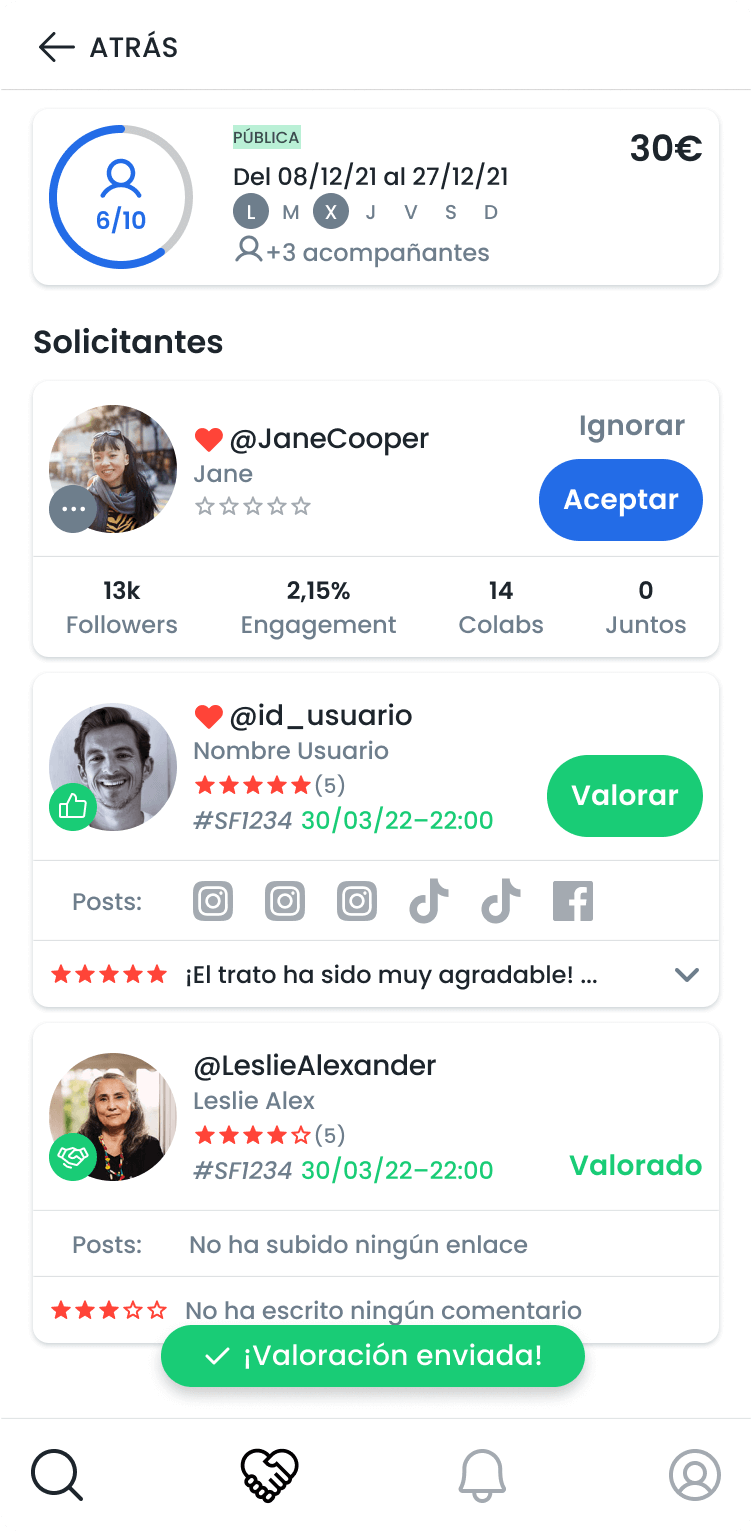
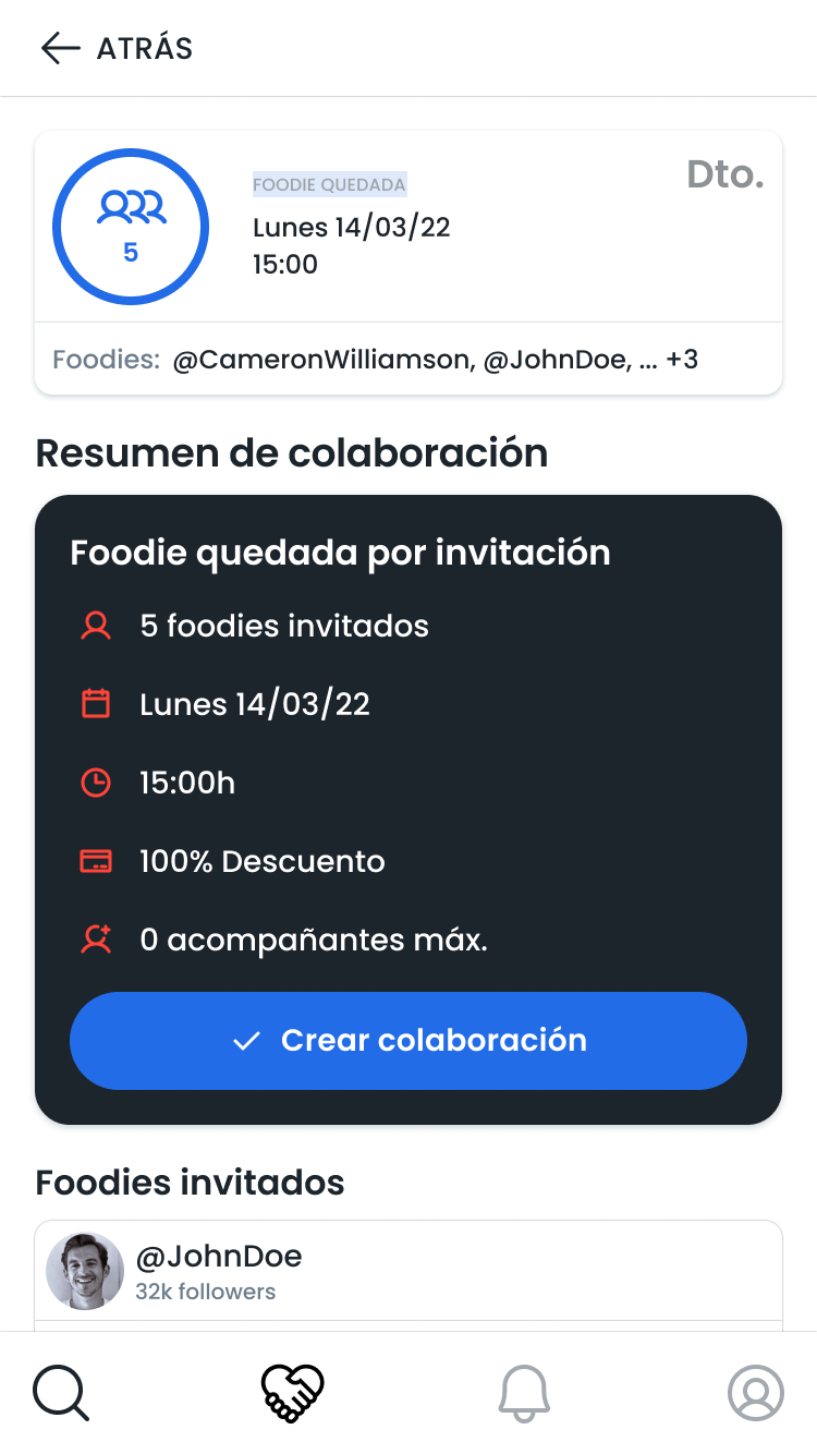
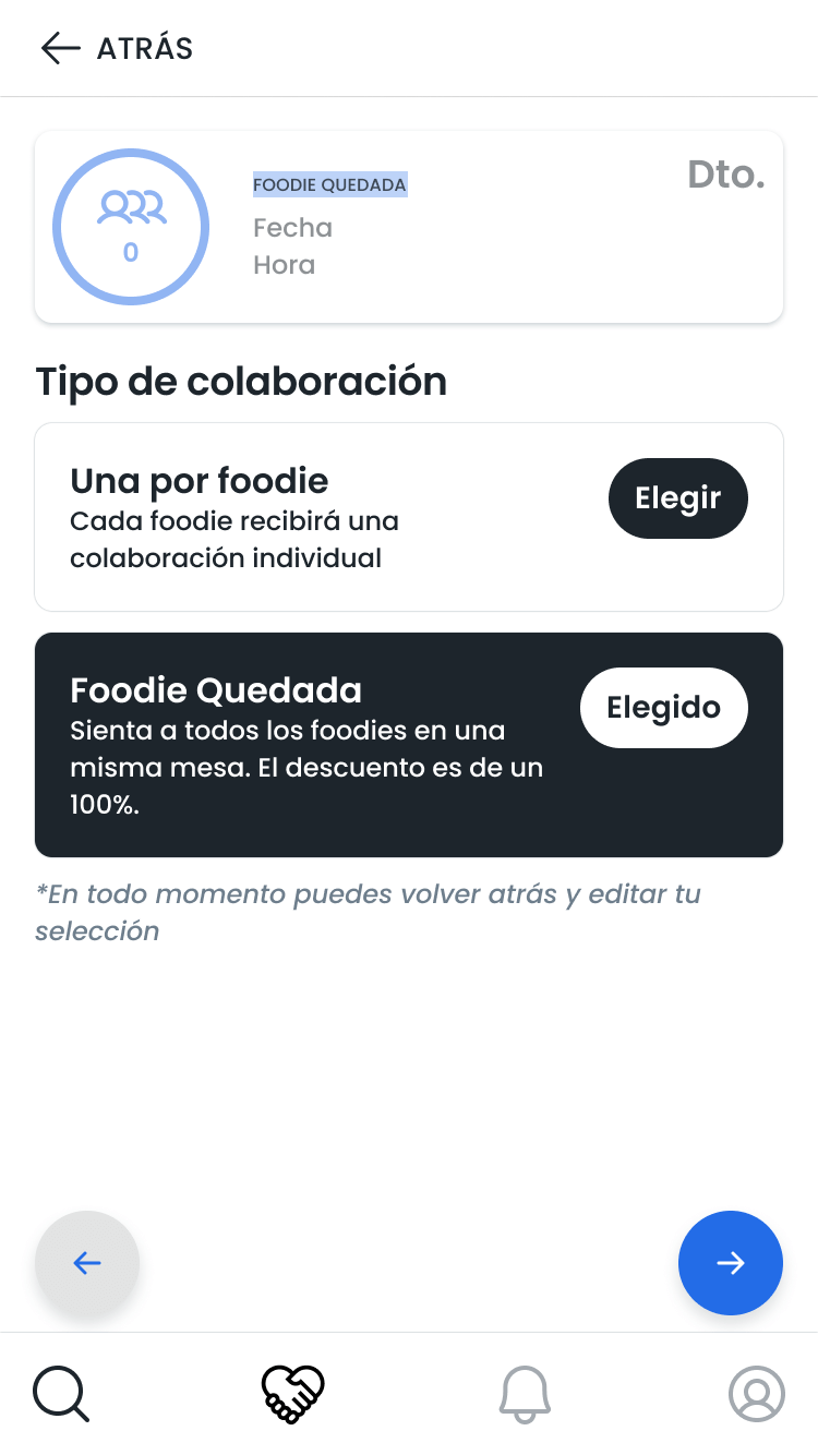
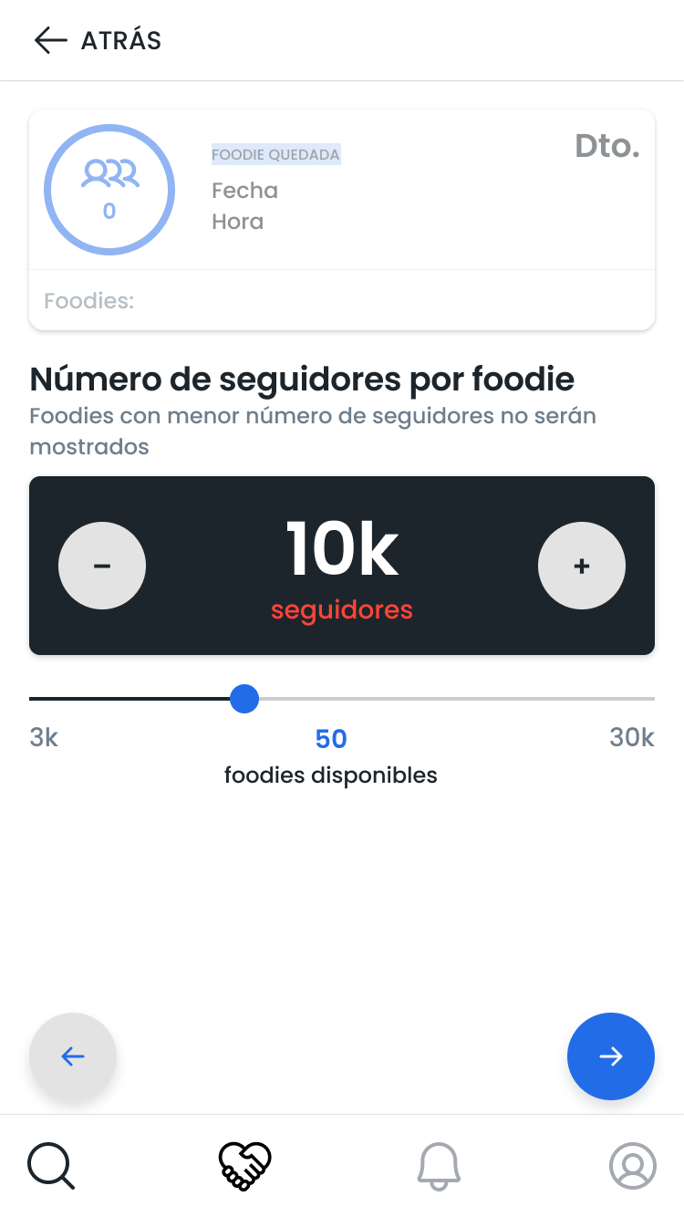
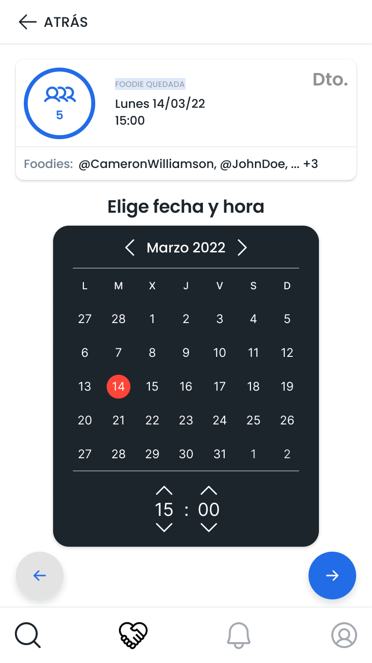
Each type of collaboration required different information. However, all collaborations shared a same pattern. Among the important information displayed, the common points were:
• The discount in the offer
• A date range (individual collabs) or specific date (foodie meetings)
• The number of companions (individual) or guests (meetings)
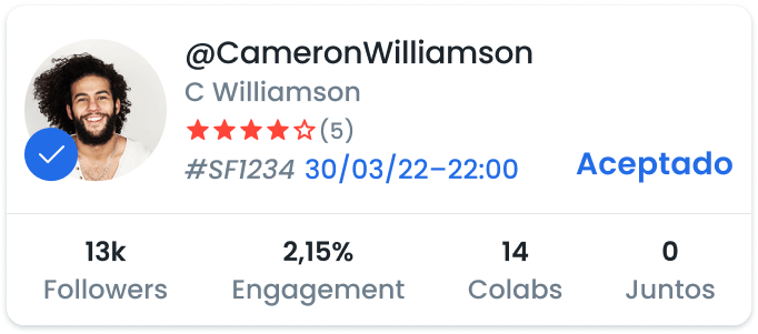
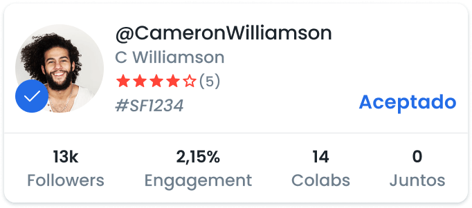
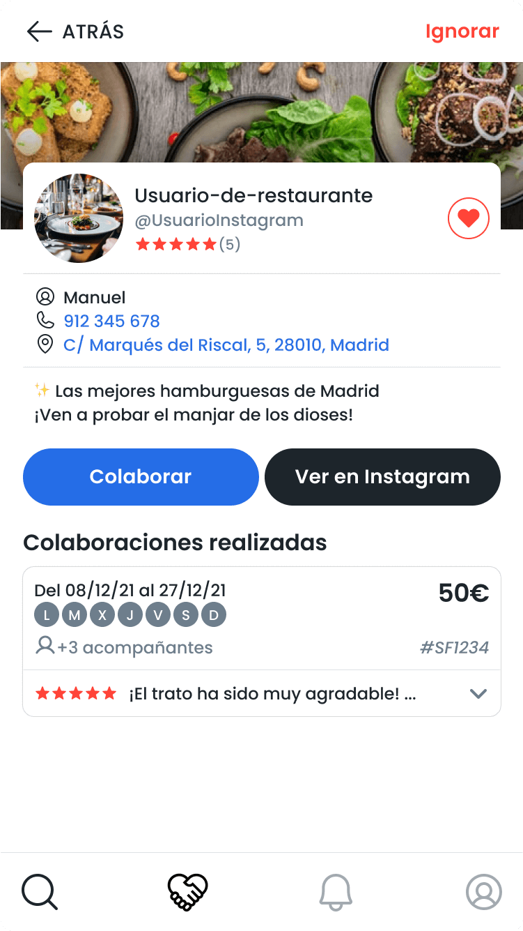
But the most important piece of information was different for restaurants and foodies. Restaurants needed to have an overview of all the collaborations in the same campaign. In the case of the foodies, it was the restaurant's name.
We decided to build a similar component for both views, sharing the same design structure through the platform.
Ruben and Isaac wanted a clean and not too-colorful interface, so I decided to utilize basic colors (green for confirmation, blue for accent, yellow for alert, and red for deletion) and the same palette for the tags. We decided that the default collaboration would be an individual and private invitation, and made a tag for public collaborations and foodie meetings.
Six months later, Solofoodies came with a new logo, and counted on me once more to redesign the rest of the platform.
After their first launch and with some clients and traction, Ruben and Isaac contacted me again to make some improvements in Solofoodies. They also had a new logo built and brand colors, and wanted to modify the UI to match their new visual identity. We redefined some colors to match the brand, but kept the product's UI bright and clean.
We reworked all the UX and UI visuals of the product, from the onboarding to every detail of the collaborations.
They collected a lot of feedback from users, especially from restaurants. For example, there were users creating collab invitations for two different days of the week separately because they could only choose between "weekday" and "weekend". We reworked the design of the weekdays, so they could customize it more easily.
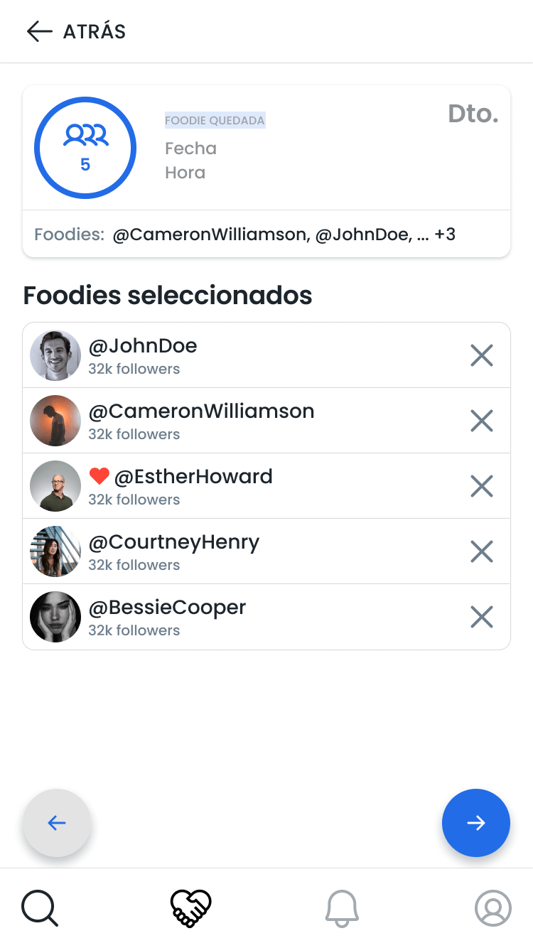
Another example is how restaurant users couldn't recognize the different collaborations that they made. Displaying the invited foodies' pictures wasn't an option from the beginning due to technical reasons. The final solution was to show the names of the foodies in the collaboration.
We also redesigned the way restaurants made their invitation, showing step-by-step how they were creating the new collaboration card. This would help them to situate all the information on the card.
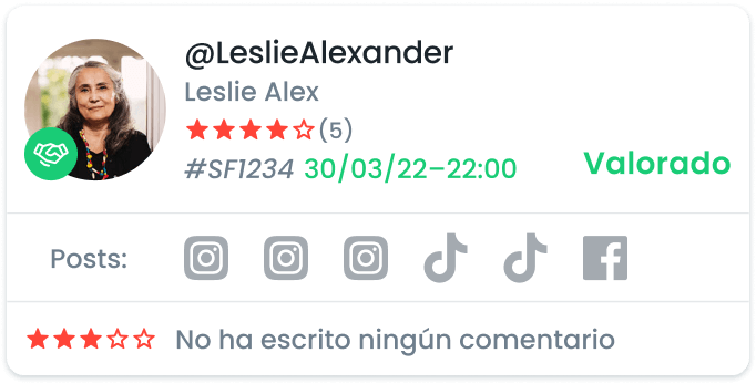
Restaurants promotion is the final goal, and that's what Solofoodies wanted to encourage in the platform. Reviews were a key matter.
More on the user experience perspective, another issue for them was the collaboration and reviews management, the main dish of the platform.
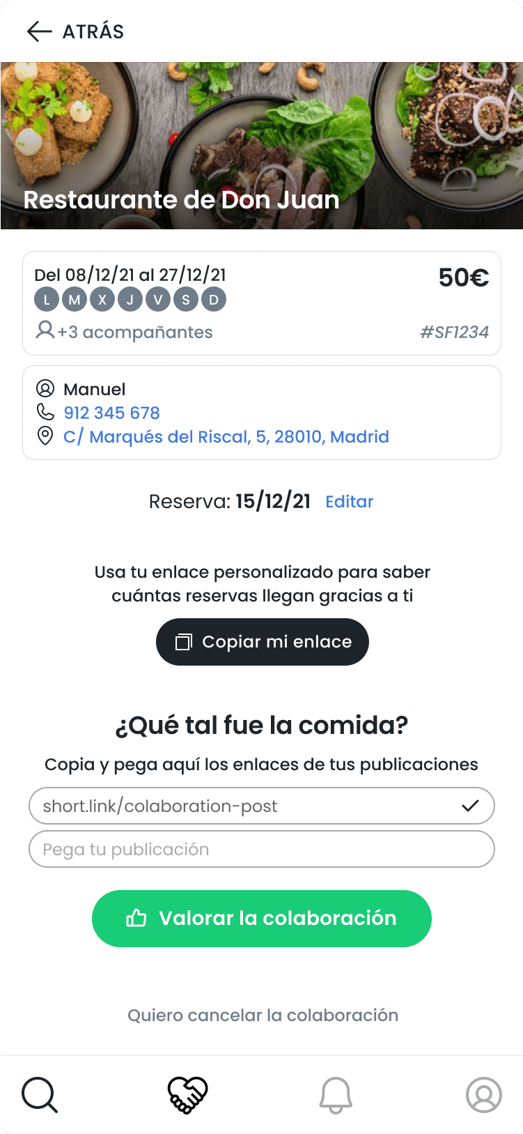
We needed foodies to upload the collaboration posts and make them visible for the restaurant. Furthermore, we needed the restaurants to assess the foodies once they made their collaboration public. We made the reviewing process a modal card to inspire agileness and simpleness.
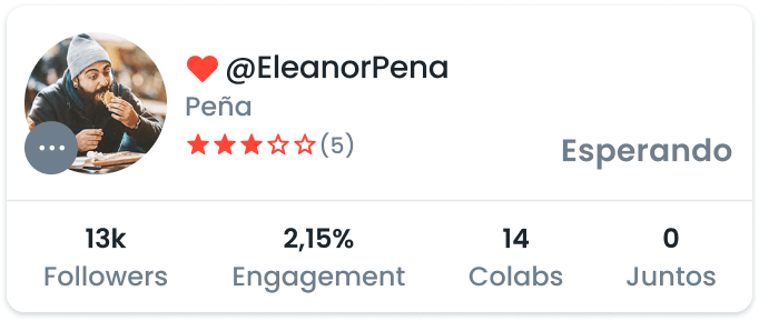
To make reviews and reliability, we gave them importance in the UI by displaying them clearly in the profile and attaching it to the collaborations.

For the previously designed collaboration cards (and the new foodie cards), we created add-on extensions with relevant information for the context
The collabs between foodies and restaurants go through a lot of steps, before and after the assistance to the venue.
First, either the foodie requests a collaboration or the restaurant sends an invitation. Then, the other party accepts.
Since there's so many steps and we need to visualize them in the platform –especially for restaurants, which have to deal with a lot of collaborations with diverse foodies– we felt the need to include different information depending on the state of the collaboration.
As shown below, the information of interest changes depending on the phase of the collab. This concept ended up being applied to collaboration cards and profile cards as well.